Yes, that’s actually a distinction I like to use when talking about my scrap quilts. There are those that are unplanned and those that are planned. Scrap quilts use a large variety of color prints to create their look, but there can be some control to it if you like. In this post, I’ll talk about the differences and how to spot these types of quilts at a show. Hopefully you will then create your own scrap “masterpiece”, whether it’s planned or unplanned.
Unplanned Scrappy
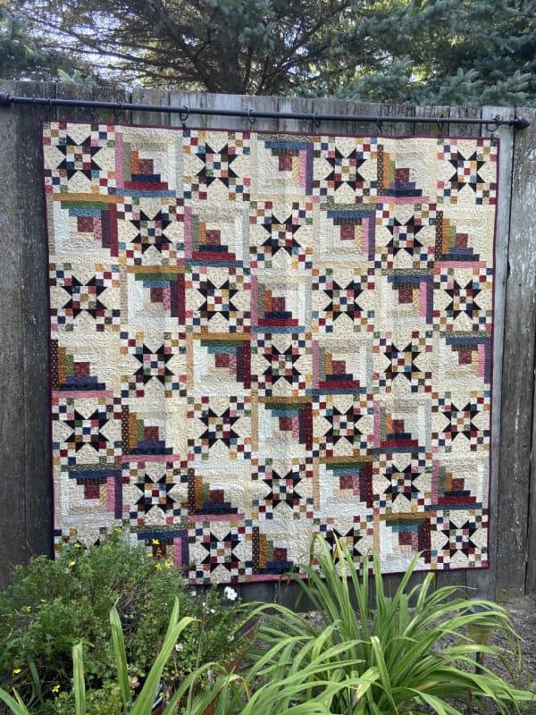
Below are some of what I call “unplanned” scrap quilts. These are quilts where I did not choose the color scheme prior to making the blocks. I just sat in front of a bin of strips and scraps and made each block. Even the tan prints in the blocks are scrappy.
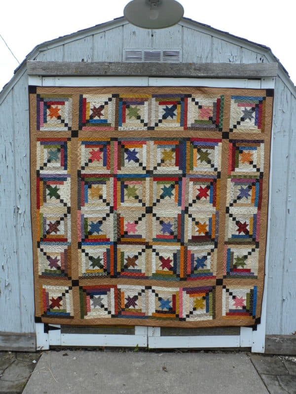
In Follow the Stars (left), to keep things even scrappier I put each block up on a design wall after piecing it and used it as a guide as I was pulling scraps & strips for the next block. This helped to keep me from repeating fabrics and colors in blocks next to each other.
For Strips & Stars (right) I did the same trick, building blocks while referring to those already finished. That’s about as planned as it gets with an unplanned scrap quilt.
Taming the Chaos of Unplanned Scrap Quilts
There are several ways to “tame” the chaos of an unplanned scrap quilt if desired. You can add in a piece in the same color to each block, generally in the same place, for some cohesion. You can also add a bit more of that uniform color to create a pattern within the block for a more noticeable secondary design once the blocks are joined. I did that above in Follow the Stars with the black fabric pieces in the blocks. But I still made those pieces scrappy by using different black fabrics in each block.
Here’s two more examples using a lap quilt and an wall hanging quilt:
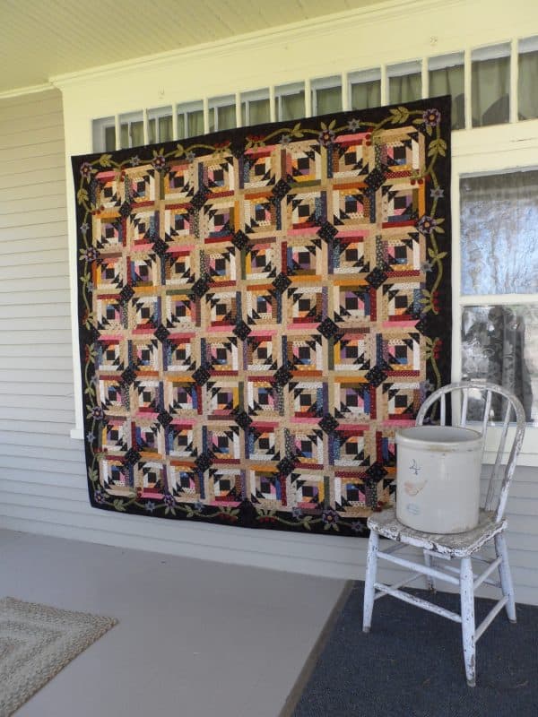
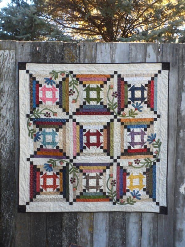
Both Crisscross Cabin Blooms (left) and Kaleidoscope (right) have a black element added to each block to add in some uniformity.
Another way to tame the unplanned scrap quilt is to add in a one color border like I did below.
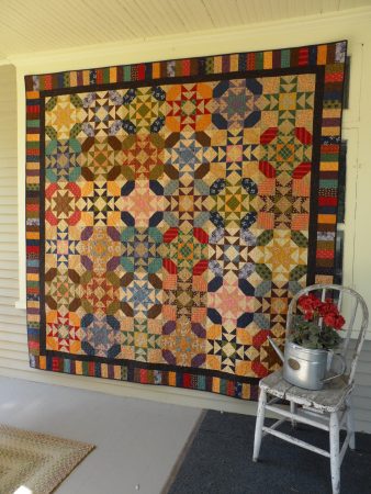
The black border between the blocks and the scrappy piano key border in Scrappy North Stars adds a calming element.
The same effect is achieved in a way with my quilt, Seaside Cottage, but in a little bit of a “scrappier” way.
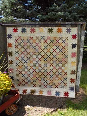
This quilt is made up of a lot of scrappy nine-patch blocks made from strips pulled from my stash. The pieced star border adds a bit of uniformity. Even though the star blocks are in various colors, the blocks themselves are a little “quieter” than the center scrappy nine-patches and there is a planned amount of stars from a set amount of fabrics.
Planned Scrappy
I consider a planned scrap quilt one that uses several different color prints, but a finite number. This is in contrast to the unplanned above where there are a large number of different colors and prints. Here is one example:
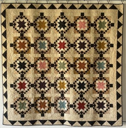
In Sun Catcher, there is a sent number of colors. I chose 8 assorted color prints and made the 25 star blocks from just those colors.
Here’s another example. Sparkler, when viewed from a distance, looks really scrappy. But when you look closer, you can see there are just 8 different color prints used.
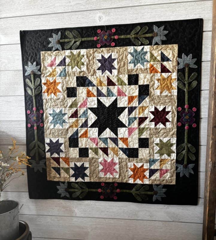

Those color prints are repeated on all 4 sides of the sawtooth border of the center star. And those fabrics are also used to make the bordering smaller stars.
Next is an example of a planned scrap quilt has a trick to make it look scrappier. Here is Trinkets:
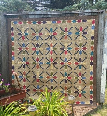
Here’s a closer look at one of the row of this quilt:
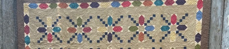
You can see that every other block has the same 4 color prints but, by rotating the similar blocks one turn, it fools the eye into thinking they are made from different fabrics. That’s one way to make a limited amount of prints look scrappy in a quilt.
Here’s another way. In this quilt below, Star Wheels, I still use a limited amount of color prints but I mixed and matched them in the same block type, alternating in which part they appear.
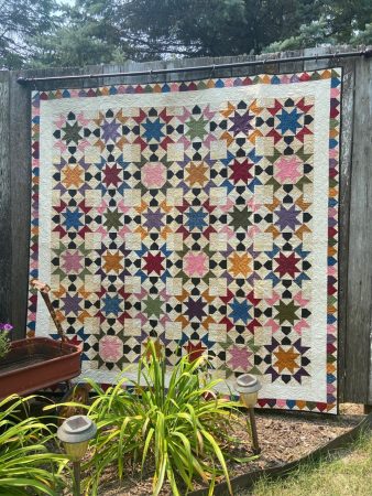
Here’s a close up of a few of the rows:
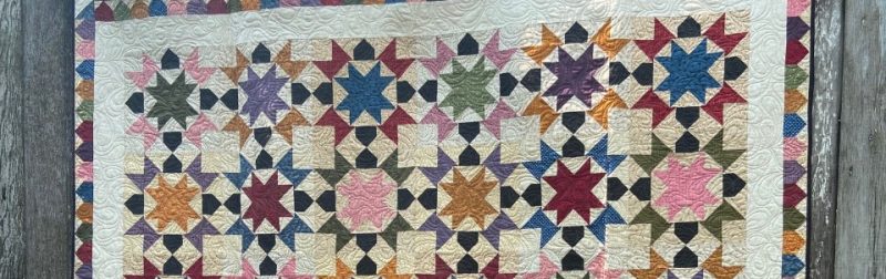
Look at block at the upper left first row and the one on the far right of the second row. They are both using the same color prints, pink and green, but the colors are reversed where they appear in the block. This helps to create a more scrappy look with a set amount of color prints.
Finally, believe it or not, there are only 8 assorted color prints in this quilt, Twilight Desert:
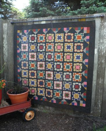
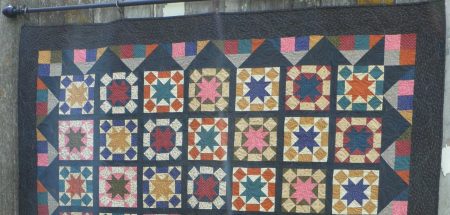
By alternating where the dark and light fabrics appear in the blocks, the illusion that there are more fabrics use is created. Here’s a closeup of a few rows:
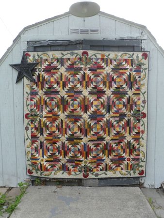
That’s it for this week! Leave a comment or ask a question below and I will enter you into the drawing for my pattern, Hugs & Kisses:
The drawing will be on Monday, 11/24. ***We have a winner! Congrats, Debi!***
Happy Quilting!
Deanne


